License to Touch: Interactive Paintings
Remember on trips to the museum when your mom used to say, “This place is for looking, not touching”? Then for the rest of the trip all you could think about was how much you wanted to touch everything? For most of my childhood, one of my absolute least favorite things to do was go to those museums where every other piece on the wall was a sign that said, “Do not touch.” Art museums were the very worst; the idea that someone would taunt me with all this stuff that I could only explore with my eyes was outrageous. That, combined with the fact that staring at paintings was far too monotonous of an activity for my energetic self to handle, made museums a torturous activity. It’s a wonder that my mom continued taking me on those day trips to Boston’s finest museum collections, despite my clear ingratitude.
It took me most of my growing years to learn to appreciate museums. I had to come to terms with the [fairly blatant] fact that if I were permitted to touch a painting, all the other millions of visitors would be as well and that’s just not a good situation for anyone, least of all the painting. When it comes to traditional art, we often have to rely on our visual skills to do most of the assessing.
That is, until traditional art took a dose of digital medicine.
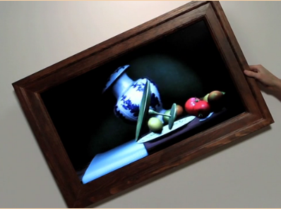
This digital creation by artist Scott Garner from the design and production company, Süperfad flips tradition on its head. No longer are paintings merely for observation. For that matter, no longer are still-lifes actually still. Using the game development tool Unity3D, Garner recreated a still-life scene consisting of fruit and dishware, in which the objects actually react to gravity. As the picture frame (actually a framed flat screen television) is tilted at an angle, the objects in the frame slowly tip over, much as objects would do in real life if the surface they rested on were at a slant.
The playful nature of this piece is riveting – seeing a still-life defy its very stillness is a beautiful contradiction. Watching a still-life, often devoid of any emotion, transform into a mildly hilarious scene of fruit rolling around on a table and dishware bouncing every which way, is a fun, lighthearted reinterpretation of something that’s often in the what-you-see-is-what-you-get category.
Now, imagine walking into a museum full of interactive pieces like this. Where patrons could twirl paintings and watch as Picasso’s cubes came crashing down, or Monet’s lily pads floated serenely down moving water. Those taunting “Do not touch” signs that we’ve grown so accustomed to seeing at museums would, at last, be nowhere in sight.
http://www.psfk.com/2012/01/interactive-painting-motion-sensing.html

I love this idea, and I can imagine spending a lot more time with these paintings than I ever would at the MFA. It makes me think of the pics in Harry Potter. There is something very compelling in having THEM respond to US.
I agree, definitely a little Harry Potter magic brought to life.