The Third Dimension of Posters
A little sidenote/intro: I receive an e-newsletter everyday from a site called www.psfk.com, self-proclaimed “Your go-to source for new ideas and inspiration.” This tagline could not be truer. This newsletter compiles short articles about recent trends and news in design, media, marketing campaigns, and art (you can now probably understand why I’m such a dedicated fan). I just wanted to give www.psfk.com a big shout-out since I get many of my blog ideas from its articles, and it’s one of the only sites that sends me newsletters everyday that I don’t automatically Move to Trash.
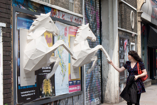
I found this next feature, predictably, on www.psfk.com. A British band called Dry the River completely revolutionizes the meaning of “pop art” with their posters:

The subject matter of this poster doesn’t even have to be interesting for a person walking by to stop and notice. Beyond the intricate design and meticulous sculpture, this is a creative marketing solution that the vast majority of standard 2-D posters lack. There is something very lively and present about this work that pulls you into the action and causes you to pause, ponder, and ultimately figure out what it could possibly represent. So you read the sparse caption below, are curious enough to check out the website, and poof – it’s a marketing success.
I just hope these delicate posters were left unharmed, by weather and humans alike…such is the risk you take with public outdoor art.
Here’s a video that documents the making of these posters: Dry the River Horses (a 3D paper-craft poster project)

Was that glue to make these paper horses made out of horses’ hooves? That would just not be right.
Wow these are amazing!