Doodles and Fonts: A Blogger’s Confession
I am an avid doodler. I doodled my way from elementary school through high school and college, on assignment notebooks, planners, homework assignments, and fliers. If a container of crayons is present on a restaurant table (shoutout to the beloved Molly’s in Hanover, NH), I won’t hesitate to put them to good use. I shamelessly cover the spare white space of newspapers with shapes and words that frame each article. Maybe doodling helps me focus, but honestly, I think it’s just plain fun.
I have a propensity for doodling my name over and over again, which I’ve learned is not all that uncommon, and does not necessarily indicate egotism (phew). Rather, I learned from the BBC that “repeatedly doodling your name is a sign of an identity problem. These doodles are often done by recently married women in attempt to assure themselves of their new surname*.” Luckily this doesn’t apply to me just yet (dodged a bullet there). Moving right along.
The letters that make up our names are some of the first shapes we learn to recognize and create. As our “drawing vocabularies” expand and we bombard our brains with new shapes and characters, we always have our names as a point of reference. To me, this is far better logic than all of us name-doodlers owning up to our insecurities about new surnames.
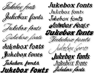
Part of what I love so much about doodling my name is the unlimited number of styles with which I can write the same thing. I think there’s something really artistic and expressive about fonts – how we use them, what they symbolize, how they’re interpreted, how we expect them in certain contexts, etc. I was that girl in elementary school who would spend at least 45 minutes picking out the font for paper titles (so my font obsession started at least that early). I was captivated by the extensive options that Microsoft Word provided, but more than that, I was excited to be able to relay a deeper meaning through the typography, the design of the letters themselves.
I’ve since learned that the only acceptable font for writing papers is Times New Roman (thanks, Professor Marcus). So when I stumbled across this 6-minute video a last week, I knew it was my chance to give fonts some love. Several font experts (typographers) talk about how fonts give us context for meaning in everything we read and influence us far more than we realize. Designer Paula Scher, one of the women interviewed in this video, puts it best: “Words have meaning and type has spirit. And the combination is spectacular.”

This was my favorite post so far Laurel! Very relatable (probably for our whole family of doodlers) 🙂
Aww thanks Marielle! I’m so glad you relate, but there was no doubt in my mind that you would! Afterall, we Marcuses are expert-doodlers.
Soooooo, what IS the MoSt beAuTIfuL typEfaCe EvEr????
I’ve always been a fan of Vivaldi…but the Marcus is me says Times New Roman is the best.
1. the math equation to post an answer was harder than expected.
2. cute post (yay my first time on Laurel’s blog, so reading them all)
3. I’m confused — last time i saw Marielle she was definitely NOT old enough to be able to type on a computer. Are we really that old?
@Elianna:
1. You’re an i-banker. Please don’t say things like you’re bad at math. Makes the rest of us look bad.
2. Thanks for reading! Glad you FINALLY made it to my blog
3. Marielle is definitely in high school. But Ari is still in kindergarten, right?